Moving to Seattle, How's the Weather? (graphs!)
Feb 25, 2015 00:00 · 1608 words · 8 minutes read
My wife and I recently relocated from Charlotte, NC to Seattle, WA and so far we’ve loved it!
One of the most common things people talk about when you mention moving to the Pacific Northwest is the weather, particularly the kind that results in being wet. The weather here is obviously different, but in my short time here it hasn’t seemed that different. Being the scientific type, I went straight to finding objective data to make heads or tails of my impression so far.
First step was to find some hard weather data. I wanted historical weather data by date and city, preferably for free. I was able to find that via Weather Underground’s API . I hacked together a quick python script to grab data for the dates I needed.
import requests
import json
from datetime import datetime,timedelta
import re
import time
import os
import sys
import arrow

APIKEY = '__REDACTED__'

def urliter():
	Locations = [
		('NC', 'Charlotte'),
		('WA', 'Seattle')
	]

	def DateIter(start, end):
	    start = arrow.get(start)
	    end = arrow.get(end)

	    for day in arrow.Arrow.span_range('day', start, end):
	        yield day[0]

	for location in Locations:
		for day in DateIter('2014-11-12', '2015-02-24'):
			url = 'http://api.wunderground.com/api/{key}/history_{year:04d}{month:02d}{day:02d}/q/{state}/{city}.json'.format(**{
				'key':APIKEY,
				'year':day.year,
				'month':day.month,
				'day':day.day,
				'state':location[0],
				'city':location[1],
			})

			directory = location[1]

			filename = '{year:04d}{month:02d}{day:02d}.json'.format(**{
				'year':day.year,
				'month':day.month,
				'day':day.day
			})

			yield (
				directory,
				filename,
				url
			)

for rq in urliter():
	directory,filename,url = rq

	time.sleep(7)
	print("get:", url)
	respobj = requests.get(url).json()

	dirpath = os.path.abspath(directory)
	if not os.path.exists(dirpath):
		os.makedirs(dirpath)

	filepath = os.path.join(dirpath,filename)
	print("save:", filepath)
	with open(filepath, "w") as opf:
	    json.dump(respobj, opf, indent=3, sort_keys=True)
That effectively grabbed and organized all the data, and conformed to the rate limit (10 requests / minute). The next step I took was storing it all in a query-able format, so I turned to my old friend MongoDB.
import json
import os
from math import sqrt,pow
import sys
from pymongo import MongoClient
import arrow

def fileloader(directory):
    adir = os.path.abspath(directory)
    for dirpath, dirnames, filenames in os.walk(adir):
        for filename in filenames:
            filepath = os.path.join(dirpath, filename)
            _,etx = os.path.splitext(filepath)
            if etx == ".json":
                with open(filepath) as opf:
                    yield filepath, json.load(opf)

locations = (
    ("Seattle", "WA"),
    ("Charlotte", "NC")
)

client = MongoClient()
weatherdata = client.weatherdata

summaries_db = weatherdata.summaries
observations_db = weatherdata.observations

for loc in locations:
    city,state = loc
    for filepath,datapoint in fileloader(city):
        summary = datapoint['history']['dailysummary'][0]

        isodate = "{year}-{mon}-{mday}T{hour}:{min}:00.000".format(**summary["date"])
        del summary["date"]

        summary.update({
            "city" : city,
            "state" : state,
            "isodate" : arrow.get(isodate).datetime,
        })

        sum_id = summaries_db.insert(summary)
        # print("summary", rec_id)

        observations = datapoint['history']['observations']
        obs_ids = []
        for observation in observations:
            isodt = "{year}-{mon}-{mday}T{hour}:{min}:00.000".format(**observation["utcdate"])
            del observation["date"]
            del observation["utcdate"]
            observation.update({
                "city" : city,
                "state" : state,
                "isodatetime" : arrow.get(isodt).datetime
            })

            obs_id = observations_db.insert(observation)
            obs_ids.append(obs_id)
        print city, ":", summary['isodate']
Having it stored in MongoDB made it quick and convenient to query the data and pick apart how to interpret the data into something useful. I was primarily seeking to represent the general distribution of temperatures, humidities, and intensity/types of precipitation between the two cities. Eventually, I threw together a script to grab all of that data and throw it into plots using plotly’s python API.
from pymongo import MongoClient
import plotly.plotly as py
from plotly.graph_objs import *
import json

client = MongoClient()
weatherdata = client.weatherdata
observations_db = weatherdata.observations
summaries_db = weatherdata.summaries

filters = {
    '_id':False,
    'isodatetime':False,
    'isodate':False,
}

charlotte = observations_db.find({
    'city':'Charlotte'
},filters)

seattle = observations_db.find({
    'city':'Seattle'
},filters)

# print(json.dumps(list(sorted(set([c['conds'] for c in charlotte])))))

def getvals(dataset, params):
    output = tuple([] for _ in params)

    for point in dataset:
        for i,param in enumerate(params):
            key,filt,typ = param
            val = point[key]
            if filt(val):
                output[i].append(typ(val))

    return (output if (len(output) > 1) else output[0])

validtemp = lambda val:val != "-9999"
validhum = lambda val:val != "N/A"
validcond = lambda val:val != "Unknown"

params = (
    ('tempi', validtemp, float),
    ('hum', validhum, float),
    ('conds', validcond, str)
)

clt_temps,clt_hums,clt_conds = getvals(charlotte, params)
sea_temps,sea_hums,sea_conds = getvals(seattle, params)

name = 'Charlotte vs. Seattle Temperature'
plot_url = py.plot(
    Figure(
        data = Data([
            Box(
                y = clt_temps,
                name = 'Charlotte',
                jitter = 0.3
            ),
            Box(
                y = sea_temps,
                name = 'Seattle',
                jitter = 0.3
            )
        ]),
        layout = Layout(
            title = name
        )
    ),
    filename = name
)
print(plot_url)

name = 'Charlotte vs. Seattle Humidity'
plot_url = py.plot(
    Figure(
        data = Data([
            Box(
                y = clt_hums,
                name = 'Charlotte',
                jitter = 0.3
            ),
            Box(
                y = sea_hums,
                name = 'Seattle',
                jitter = 0.3
            )
        ]),
        layout = Layout(
            title = name
        )
    ),
    filename = name
)
print(plot_url)

intensities = [
  "Heavy Thunderstorms and Rain",
  "Thunderstorms and Rain",
  "Heavy Rain", "Ice Pellets", "Light Ice Pellets",
  "Light Freezing Rain", "Rain", "Light Rain",
  "Light Snow", "Light Freezing Fog",
  "Drizzle", "Light Drizzle", "Mist",
  "Overcast", "Fog", "Haze",
  "Mostly Cloudy", "Partly Cloudy",
  "Scattered Clouds", "Clear"
]

def countintensities(dataset):
    counts = {}
    for cond in dataset:
        counts[cond] = ((counts[cond]+1) if counts.get(cond) else 1)

    countgetter = lambda val:(counts[val] if val in counts else 0)
    return list(map(countgetter, intensities))

name = 'Charlotte vs. Seattle Weather Rain Intensity'
plot_url = py.plot(
    Figure(
        data = Data([
            Bar(
                x = intensities,
                y = countintensities(clt_conds),
                name = 'Charlotte'
            ),
            Bar(
                x = intensities,
                y = countintensities(sea_conds),
                name = 'Seattle'
            )
        ]),
        layout = Layout(
            barmode='group',
            title = name
        )
    ),
    filename = name
)
print(plot_url)

charlotte = summaries_db.find({
    'city':'Charlotte'
},filters)

seattle = summaries_db.find({
    'city':'Seattle'
},filters)

validprecip = lambda val:val != "T"

params = (
    ('precipi', validprecip, float),
)

clt_precip = getvals(charlotte, params)
sea_precip = getvals(seattle, params)

name = 'Charlotte vs. Seattle Precipitation'
plot_url = py.plot(
    Figure(
        data = Data([
            Box(
                y = clt_precip,
                name = 'Charlotte',
                jitter = 0.3
            ),
            Box(
                y = sea_precip,
                name = 'Seattle',
                jitter = 0.3
            )
        ]),
        layout = Layout(
            title = name
        )
    ),
    filename = name
)
print(plot_url)
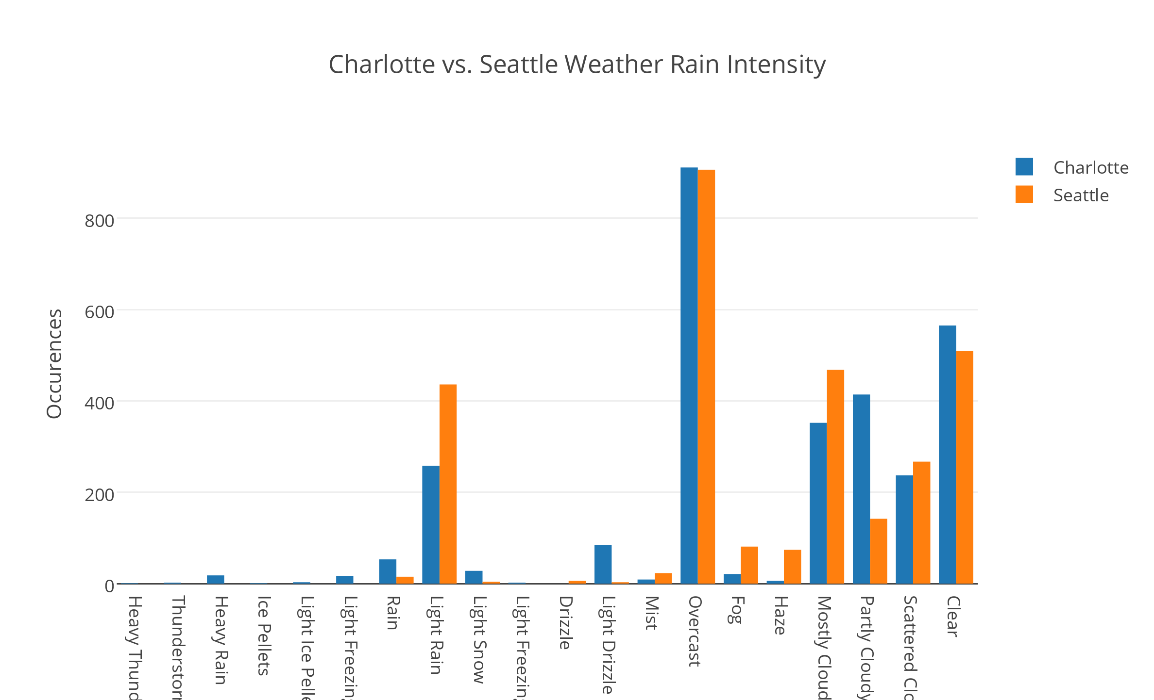
Note that weather condition intensity is organized completely based on my own subjective interpretation. {: .notice}
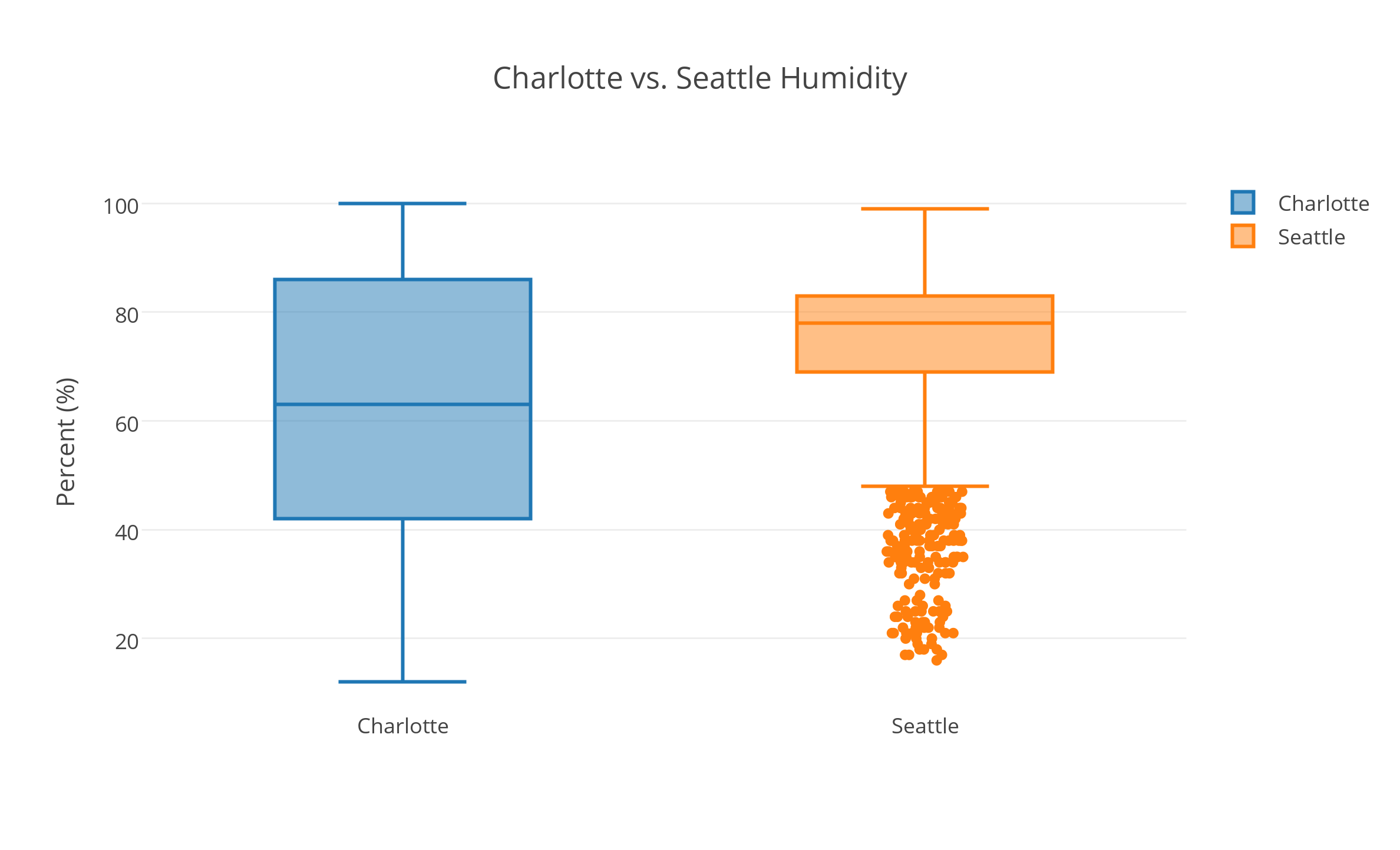
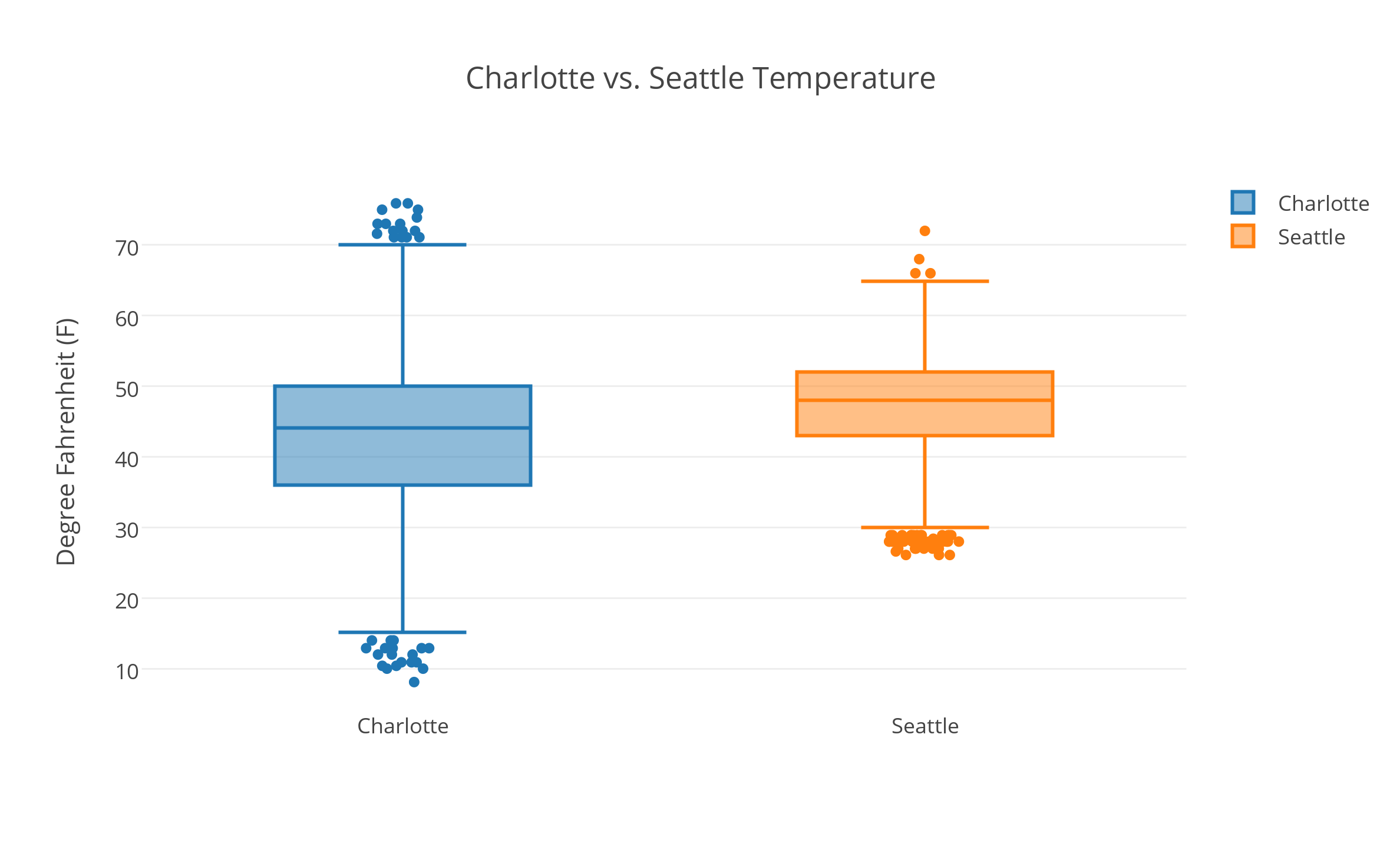
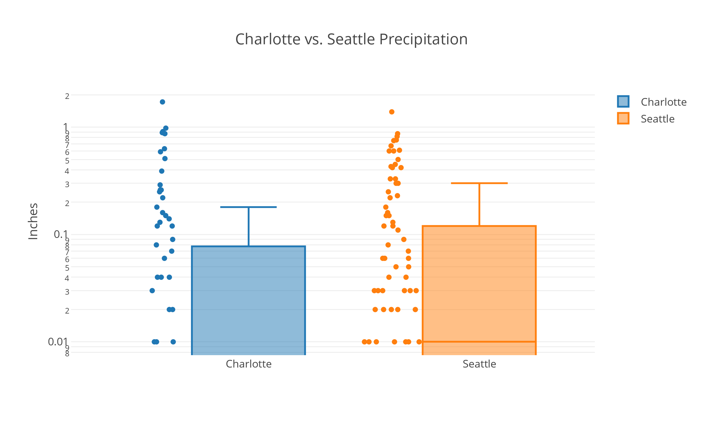
The above script gave me the following plots:
All data “Powered by Weather Underground” ![]() as per API usage requirements.
{: .notice}
as per API usage requirements.
{: .notice}
The plots pretty much showed me what I expected, that the weather here is milder, more consistent, and though it rains more, when it rains it’s usually lighter and more constant than it is in Charlotte (where apparently it can’t rain without absolutely pouring).
But there was another thing I noticed after moving here that isn’t mentioned as much. Having arrived in November I immediately noticed the sun setting nearly an hour earlier, a result of the higher latitude. I also became curious of how sunrise and sunset times differed for the cities throughout the year. Calculating sunrise and sunset times only requires performing some mathematical computations based on longitude and latitude. But since I don’t have all the time in the world I thought it much easier to google an existing module rather than re-write it from scratch, and came up with the fantastic astral module. Using this I threw up a quick script to plot sunrise, sunset, and hours of sunlight:
import arrow
from astral import Astral
import plotly.plotly as py
from plotly.graph_objs import *
import sys
import math
from dateutil import tz
import pprint

pp = pprint.PrettyPrinter(indent=3)

a = Astral()
a.solar_depression = 'civil'

start = arrow.get("2014-01-01")
end = arrow.get("2014-12-31")

types = ['sunlight', 'sunrise', 'sunset']
cities = {
    'Charlotte' : {key:[] for key in types},
    'Seattle' : {key:[] for key in types}
}

dates = [day[0] for day in arrow.Arrow.span_range('day', start, end)]
totals = {city:0 for city in cities}

def floathours(dto):
    return dto.hour + (dto.minute / 60.0) + (dto.second / 3600.0)

for location in cities:
    city = a[location]
    for day in dates:
        sun = city.sun(date=day, local=True)
        sunrise = floathours(arrow.get(sun['dawn']))
        sunset = floathours(arrow.get(sun['sunset']))
        hours_sunlight = sunset - sunrise

        cities[location]['sunrise'].append(sunrise)
        cities[location]['sunset'].append(sunset)
        cities[location]['sunlight'].append(hours_sunlight)
        totals[location] = totals[location] + hours_sunlight

d = []
for stype in types:
    for city in cities:
        d.append(
            Scatter(
                name="{city} - {type}".format(**{
                    "city":city,
                    "type":stype
                }),
                x=dates,
                y=cities[city][stype]
            )
        )

data = Data(d)

layout = Layout(
    title='Charlotte vs. Seattle Sunlight',
    yaxis=YAxis(
        title='Hours (24)',
        domain = [0,24]
    )
)

plot_url = py.plot(data, layout=layout, filename='Charlotte vs. Seattle Sunlight')
print(plot_url)

print('Charlotte: ', totals['Charlotte'])
print('Seattle: ', totals['Seattle'])
Which created this plot:
The orange lines represent Seattle, and the blue lines represent Charlotte. The lines on top represent sunset times, bottom the sunrise times, and in the middle the total hours of sunlight across the whole year. So it can be seen that daylight differences in Seattle are slightly more drastic, but with a result of more total sunlight hours throughout the year.
Besides the sunlight analysis, all of this is just superficial comparisons. This was just for kicks and gave me an excuse to mess with weather data. I’ve heard in a few conversations with locals that this winter in Seattle has been substantially sunnier than past years. Professor of Atmospheric Sciences Cliff Mass’ blog actually explains the odd weather affecting the US Pacific Northwest and Northeast really well from the perspective of someone who is actually a professional on the subject. He makes a strong case the weather patterns are due to natural variation and not global warming (while still acknowledging global warming as a pressing issue).
One thing is for sure, I can’t wait for summer here where the days will be long, the air will be dry, and the heat won’t commonly go over 70 degrees. I will not miss the humid heat of the Southeast. Also, you can’t beat the view here:
Well, hope you enjoyed my shitty weather blog. If you’re local to Seattle and happened here, hit me up! I’m interested in meeting up with more developers/makers/engineers in the area (or y’know, other cool people too).
With the post I hope to get back in the swing of blogging. I plan to pick up again on the GardenSpark project soon. I also have plans for an automated pet feeder projects in the works!